
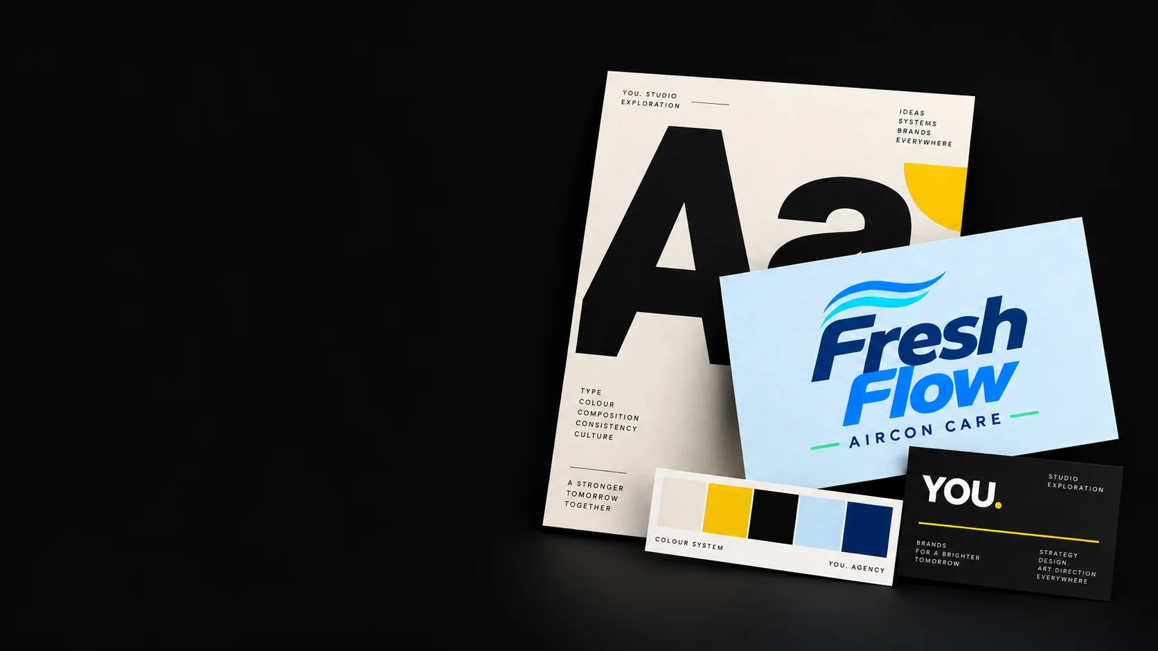
Fresh Flow Aircon Care
Brand identity · Client project
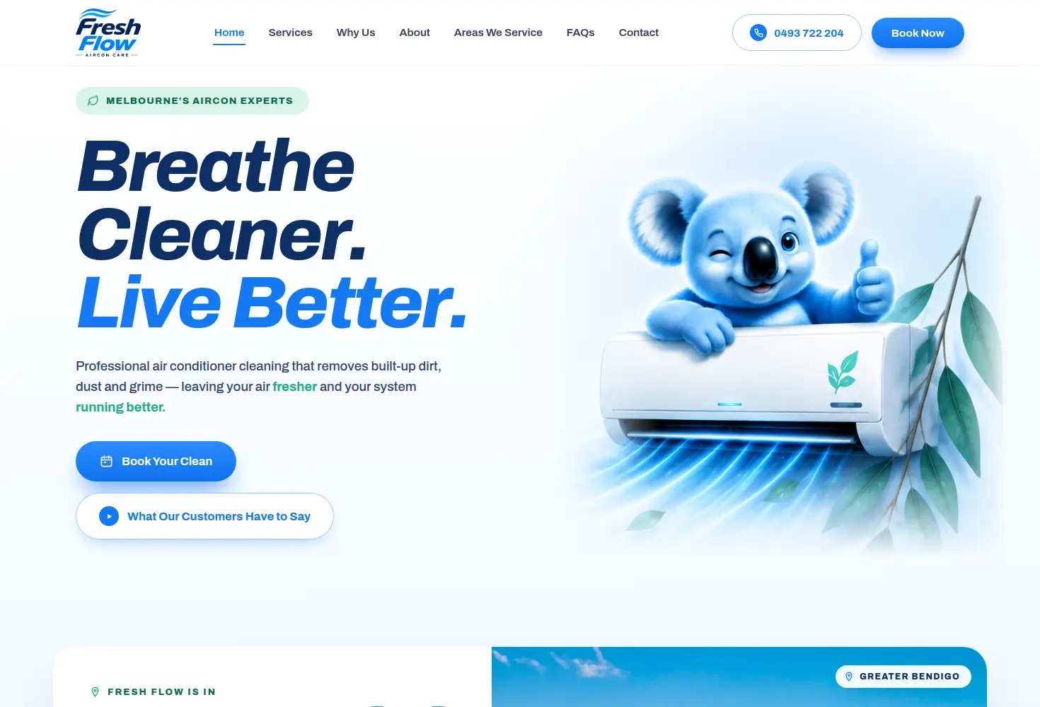
A cooling-service identity built around airflow, freshness and an approachable Australian personality — then carried through into the website.
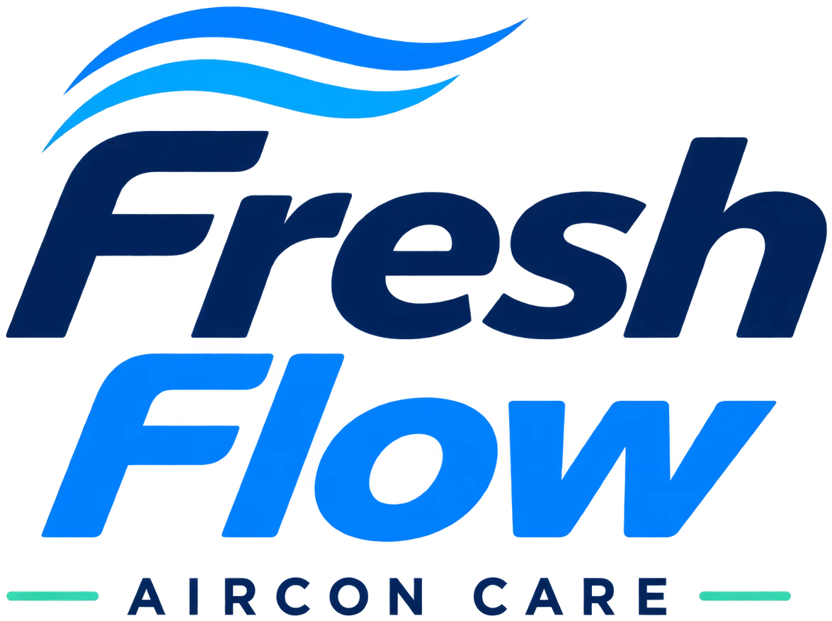
Inside the wordmark

Airflow
The paired curves suggest circulation, cooling and movement.

Letterforms
Forward-leaning lettering gives the name energy, while rounded forms keep it approachable.

Service descriptor
Widely spaced AIRCON CARE lettering keeps the service clear beneath the expressive name.
Colour and type
Deep navy establishes trust and reliability, while electric blue and cyan communicate cooling, cleanliness and technology. Mint introduces freshness and a natural Australian cue.
Archivo · 700 · headline
Breathe cleaner air at home.
Archivo · 400 · body
Short lines, generous leading and sentence case keep service copy calm and readable — the same voice the website and printed material use.
Wordmark and descriptor are supplied artwork, never re-typed
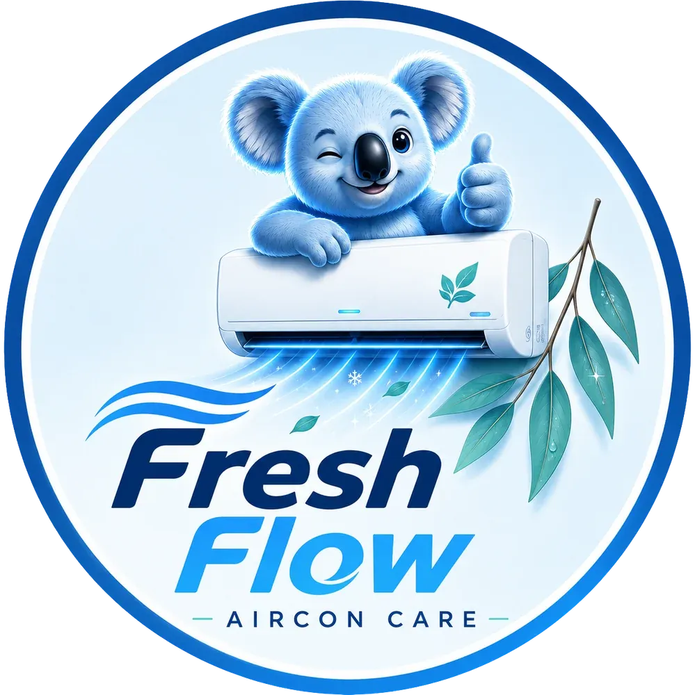
The secondary mascot
The secondary mascot adds a friendly Australian personality, with the air-conditioning unit and eucalyptus connecting the identity to cooling and freshness.
It suits applications with enough room for its detail — social profiles, stickers, vehicle decals and other large customer-facing placements — while the wordmark carries headers, signage and campaign work.
Brand guidelines
Clear space and minimum size
- Keep clear space on all sides equal to the cap height of “AIRCON CARE”.
- Minimum print width: 35 mm for the lockup, 20 mm for the badge.
- The badge carries illustrative detail, so it should not be used where the koala, leaves, equipment and descriptor stop reproducing clearly.
Colour proportions
- White 55% — the dominant surface, plain or as a white-to-ice gradient.
- Ice Blue 22% — cooled backgrounds and the field inside the badge.
- Deep Navy 14% — “Fresh” letterforms and statement surfaces.
- Electric Blue 6% — airflow, glow, buttons and links.
- Eucalyptus Mint 3% — one accent per surface: a rule, a leaf, a tick. Never a background.
Backgrounds
- Never place the lockup on a mid-blue or photographic background.
- Both marks are built for white and ice-blue surfaces, which is why they are shown on a light field here.
- No reversed version exists yet — “Fresh” is deep navy and disappears on a near-black background. It is a recommended next deliverable.
Using the marks
- Never stretch, rotate, outline or add a drop shadow.
- Never recolour the koala, or use it without the eucalyptus branch.
- Never set the wordmark in a substitute font.
- Primary wordmark: website and digital headers, signage, campaign graphics, large-format and branded documents.
- Secondary badge: social avatar, large service sticker, vehicle decal, promotional graphic.
Typography
- Wordmark: italic geometric sans — always placed as supplied artwork.
- Descriptor: AIRCON CARE, uppercase, widely tracked, set level beneath the name.
- Headline: Archivo, tight and confident, sentence case.
- Body: Archivo Regular and Medium — sentence case, short lines, generous leading.